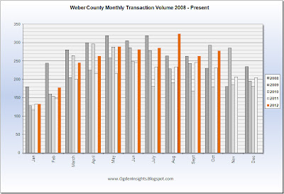
Today's charts deal strictly with sales volume. Our first chart is the long running total since the inception of the electronic MLS back in 1996. Our trendline has just surpassed the peak last seen during the dead-cat bounce that occurred due to tax credit gimmickry in 2009. FACTOID: August's sales of 324 homes eclipsed the previous highs of the summer of 2008 and was the highest sales month since JUNE 2007.
Below you can see the months from previous years stacked next to one another. This helps us see through the seasonal cycle. Things look good!
To understand how good, here is the percentage difference on Year-Over-Year sales for each month. We have seen positive growth on a monthly basis since July 2011.
Going back a little further in time, here is the annotated history of what we have experienced. Anything below ZERO means sales were contracting Year-Over-Year.
If you are considering selling your home, CONTACT ME, and lets see how quickly your home would sell in today's market.


No comments:
Post a Comment